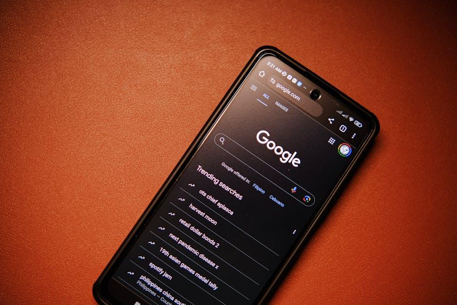
In a world where our smartphones have become extensions of ourselves, the way we interact with these devices shapes not only our daily routines but also our expectations for the future. As technology evolves at a rapid pace, so too does the art and science of smartphone UI/UX design. From intuitive gestures to immersive visuals, the trends emerging on our screens are redefining seamlessness and engagement. This article explores the cutting-edge smartphone UI/UX trends to watch-highlighting the innovations set to transform how we navigate, connect, and experience the digital world at our fingertips.
Emerging Patterns in Minimalist Design Enhancing Usability
In today’s smartphone interfaces, subtlety is making a bold statement. Designers are leaning into the power of space and simplicity to create environments where users naturally gravitate toward the most important elements. This shift means less clutter, reducing cognitive load by showcasing only essential features, icons, and gestures. Strategic use of whitespace not only enhances clarity but fosters a calming interaction that helps users focus, making navigation feel effortless rather than overwhelming.
Emerging trends emphasize intuitive layouts combined with minimal color palettes and refined typography. Frequently seen patterns include:
- Single-focus screens that highlight one action at a time
- Micro-interactions that provide subtle and instant feedback
- Muted tones paired with bold accent colors to guide attention
- Consistent iconography with simplified shapes for faster recognition
Here’s a quick comparison of features that increase usability in minimalist designs:
| Feature | Benefit | Example |
|---|---|---|
| Whitespace | Improves focus & reduces stress | Clean dashboard layouts |
| Muted colors | Directs user’s eye efficiently | Soft background with bright CTAs |
| Single-action screens | Minimizes distractions | One-step checkout |
Adaptive Interfaces Customizing Experiences for Diverse Users
Modern smartphone applications are harnessing the power of adaptive interfaces to ensure every user feels their experience is uniquely tailored. By intelligently adjusting layouts, font sizes, and interactive elements based on user preferences, environmental factors, and even biometric inputs, these interfaces create fluid and harmonious interactions. This dynamic customization not only enhances accessibility for diverse populations but also fosters deeper engagement by reducing friction and anticipating user needs before they arise.
Key components of this approach include:
- Context-aware design: Interfaces that respond to lighting conditions, device orientation, and user location.
- Personalization engines: Algorithms molding content and navigation paths based on individual behavior.
- Multi-modal input: Support for voice, touch, gestures, and even gaze control for seamless control.
| Feature | Benefit | Example |
|---|---|---|
| Dynamic Font Scaling | Improved readability | Auto-increases font in bright light |
| Adaptive Color Schemes | Eye strain reduction | Switches to dark mode at night |
| Gesture Recognition | Faster navigation | Swipe shortcuts for common tasks |
The Rise of Gesture-Based Navigation and Its Impact on Interaction
Gesture-based navigation has revolutionized the way users interact with their smartphones, moving beyond traditional button-based commands to fluid, intuitive motions. Swiping, pinching, and tapping have become the new language of digital communication, enabling faster access to apps and smoother multitasking. This shift not only declutters the screen by replacing physical or on-screen buttons but also promotes a more immersive user experience that feels natural and responsive. As devices continue to embrace edge-to-edge displays, gestures capitalize on this real estate, enhancing usability without visual distractions.
Developers and designers are now focusing on refining gesture recognition to reduce accidental inputs and improve accessibility for all users. Key benefits include:
- Enhanced screen space utilization by eliminating persistent navigation bars
- Quicker access to functions through customizable gestures
- Increased engagement via smooth, context-aware interactions
- Better consistency across different apps and operating systems
| Gesture | Function | Impact |
|---|---|---|
| Swipe up | Open app drawer | Saves time, no buttons needed |
| Pinch | Zoom in/out | Natural control for images and maps |
| Double tap | Wake screen | Increases convenience |
Balancing Aesthetics and Functionality through Effective Color Schemes
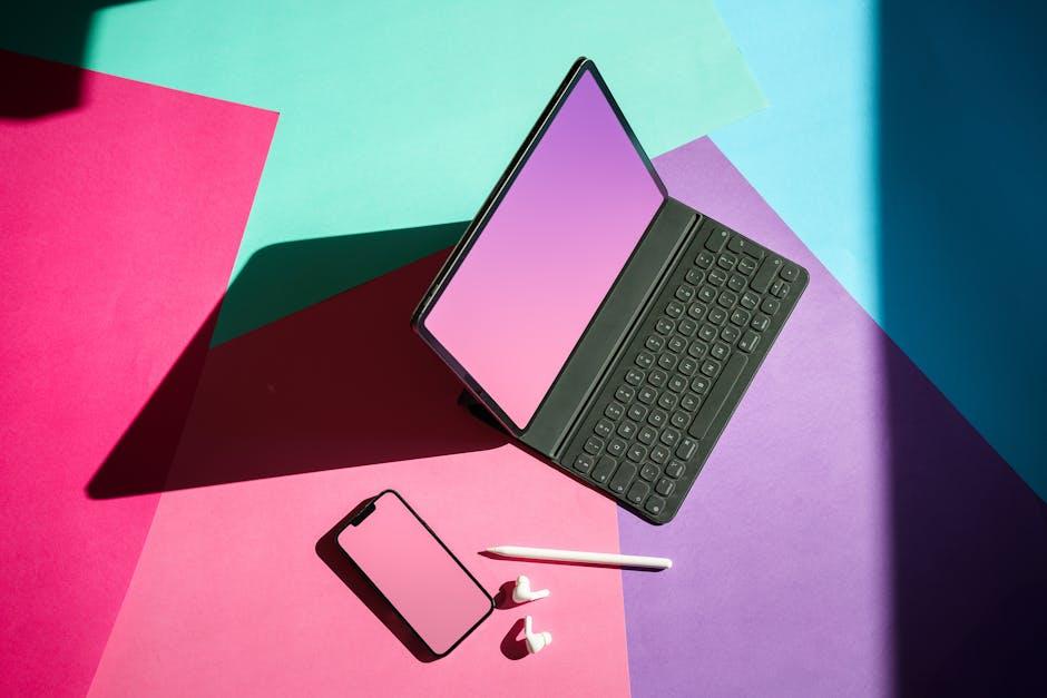
Achieving the perfect balance between aesthetics and functionality in smartphone UI/UX design hinges largely on a well-thought-out color palette. Colors are more than just visual appeal; they guide users through the interface, highlight important features, and evoke emotions that align with the brand’s identity. A successful color scheme subtly directs attention to critical actions like call-to-buttons, while ensuring background hues don’t overpower content readability. Designers are increasingly leveraging soft gradients, muted tones, and contrasting accents to create interfaces that are not only beautiful but also intuitively navigable.
When selecting colors, it’s imperative to consider accessibility and device variability, ensuring the interface remains consistent and usable across different lighting conditions and screen types. Incorporating a clear hierarchy of colors helps users distinguish various interactive elements effortlessly. Here are some key tips for effective color usage in modern smartphone UI/UX:
- Prioritize contrast: Maintain high contrast for text and actionable items to enhance readability.
- Limit color palette: Use a restrained palette of 3-5 colors to avoid visual clutter.
- Use accent colors strategically: Highlight critical buttons and notifications with vibrant hues.
- Consider cultural implications: Color meanings vary globally; design with your audience in mind.
| Color Role | Purpose | Example Use |
|---|---|---|
| Primary | Brand identity and main actions | Navigation bar, primary buttons |
| Secondary | Supporting functions and links | Secondary buttons, hyperlinks |
| Background | Setting overall tone | Screen backgrounds, cards |
| Accent | Highlighting key features | Notifications, badges |
To Wrap It Up
As the smartphone continues to evolve as an extension of ourselves, so too must the interfaces that connect us to its boundless possibilities. Keeping an eye on emerging UI/UX trends isn’t just about staying current-it’s about anticipating the ways design will shape our digital interactions and experiences. By embracing innovation thoughtfully and focusing on the human touch behind every tap and swipe, designers and users alike can look forward to a future where technology feels not only smarter but truly seamless. The journey of smartphone UI/UX is far from over; it’s an ongoing story of creativity, functionality, and connection waiting to unfold.
