In the world of culinary arts, the saying “we eat with our eyes first” holds a remarkable truth. Color, an often-overlooked ingredient, plays a pivotal role in shaping our perception and enjoyment of food. From vibrant reds that ignite appetite to soothing greens that promise freshness, the hues on a plate do more than please the eye-they influence our emotions, expectations, and even our sense of taste. This article delves into the subtle yet powerful role that color plays in meal presentation, exploring how chefs harness its magic to transform simple dishes into memorable sensory experiences.
The Psychology Behind Color Choices in Culinary Arts

Colors in food don’t just entice the eyes; they tap directly into our subconscious. Warm hues like reds, oranges, and yellows often stimulate appetite and evoke feelings of comfort and energy, making dishes appear more vibrant and inviting. Conversely, cool colors such as greens and blues can convey freshness and calmness but are less commonly seen in edibles because they might reduce the appetite. Chefs who understand these subtle psychological triggers design plates that not only taste good but visually communicate the mood and story behind a meal, enhancing the overall dining experience.
Beyond just evoking emotions, color plays a strategic role in how we perceive flavors. For instance, a sprinkle of bright red chili flakes can heighten the expectation of spiciness, while a drizzle of green pesto might signal herbaceous freshness. Below is a simple table illustrating common color associations and their psychological impacts in culinary contexts:
| Color | Reason for Appeal | Psychological Effect |
|---|---|---|
| Red | Stimulates gut and energy | Excitement, warmth, appetite boost |
| Green | Represents freshness | Calm, healthy, natural |
| Yellow | Brightens plate | Optimism, hunger enhancer |
| Blue | Rare in food | Caution, appetite suppressant |
- Contrast: Creates visual interest and helps highlight each component.
- Harmony: Balances colors to make the dish look cohesive and well thought out.
- Seasonality: Using colors that reflect the time of year enhances authenticity and connection.
Enhancing Appetite and Perception Through Vibrant Hues
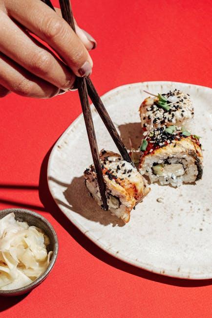
Colors possess a remarkable ability to influence our appetite and the way we perceive food. Warm and vibrant hues like reds, oranges, and yellows are known to stimulate hunger by activating parts of the brain associated with appetite. This psychological response can make dishes appear more enticing and flavorful, encouraging people to enjoy their meals even more. In contrast, cool colors such as blues and purples are less common in natural foods, often signaling caution or unpalatability, which can suppress appetite. By carefully selecting plate colors, garnishes, and food combinations with vivid tones, chefs and home cooks can create visually stimulating dishes that enhance the overall dining experience.
- Red and orange: Enhance warmth and promote hunger.
- Yellow: Evokes happiness and optimism, boosting desire to eat.
- Green: Suggests freshness and health, ideal for salads and plant-based meals.
- Blue: Rare in natural foods, calming but may reduce appetite.
| Color | Psychological Effect | Ideal Use in Meal Presentation |
|---|---|---|
| Red | Stimulates Appetite | Spices, sauces, fruits |
| Yellow | Boosts Energy & Mood | Cheese, tropical fruits |
| Green | Conveys Health & Freshness | Salads, herbs |
| Blue | Suppresses Hunger | Minimal use, perhaps plate accents |
Balancing Color Contrast for Visual Harmony on the Plate
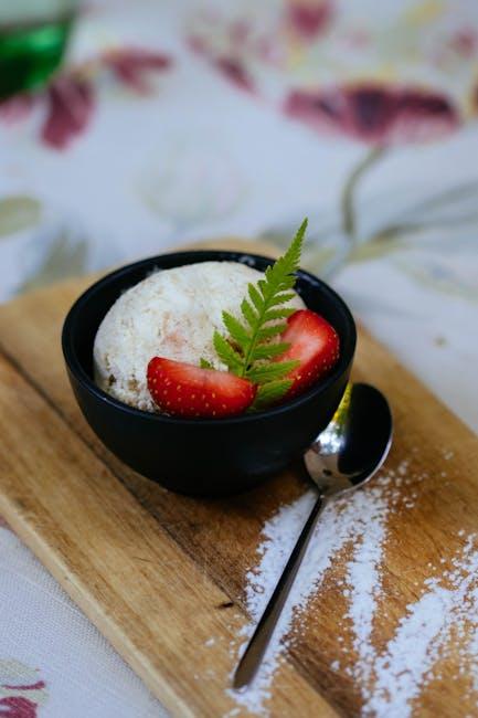
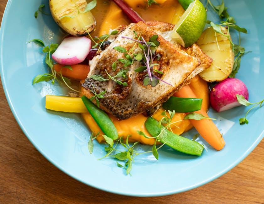
Creating visual harmony on the plate is an art that hinges on a thoughtful dance of colors. When colors contrast effectively, they invite the eyes to explore and savor every element before the first bite. This interplay between vivid hues and gentle tones avoids visual monotony and elevates the dining experience. For instance, pairing bright, fiery reds with cool, leafy greens or golden yellows with deep purples can instantly uplift a dish from plain to striking without overwhelming the senses.
To master this delicate balance, consider these key principles:
- Contrast intensity: Combine bold colors with softer shades to create depth without clashing.
- Complementary colors: Use colors opposite each other on the color wheel, such as orange and blue, for balanced vibrancy.
- Texture pairing: Smooth sauces and rough greens can alter perception of color, adding layers to the visual appeal.
- Portion size: Adjust the quantity of each color so no single hue dominates unnecessarily.
| Color Pair | Visual Impact | Common Foods |
|---|---|---|
| Red & Green | Vibrant, Festive | Tomato & Spinach |
| Yellow & Purple | Bold, Elegant | Squash & Eggplant |
| Orange & Blue | Striking, Balanced | Carrot & Blue Cheese |
Practical Tips for Using Color to Elevate Meal Presentation
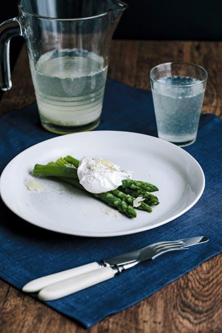
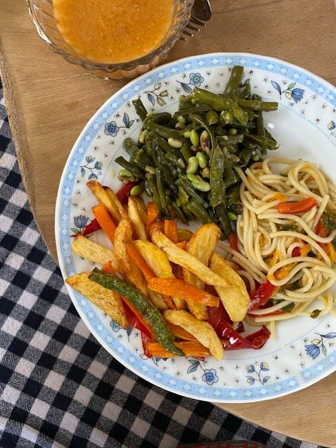
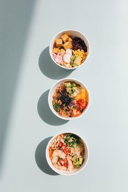
When aiming to make your meals visually appealing, consider incorporating a vibrant palette that naturally draws the eye and engages the appetite. Start by mixing contrasting colors strategically-think bright orange carrots paired with deep green broccoli or rich purple cabbage alongside creamy white potatoes. These combinations not only add intrigue but can also highlight the freshness and variety of your ingredients, making every bite feel like a new experience. Balance is key; avoid overcrowding the plate with too many colors, which can overwhelm rather than entice. Instead, select two or three dominant colors and use garnishes to subtly complement your main hues.
Another practical approach is to use color to signal the flavors and textures on the plate. Warm colors like reds, yellows, and oranges often evoke warmth and spice, while cooler tones such as greens and blues can imply freshness and crispness. To help guide your choices, consider the following simple chart that pairs color cues with common ingredient types:
| Color | Common Ingredients | Flavor/Texture Hint |
|---|---|---|
| Red | Tomatoes, red peppers, strawberries | Sweet, tangy, or spicy |
| Green | Spinach, peas, avocado | Fresh, earthy, crisp |
| Yellow | Corn, yellow peppers, lemon | Bright, citrusy, mild heat |
| Brown/Beige | Grains, nuts, roasted meats | Hearty, nutty, robust |
- Use garnishes wisely-a sprinkle of herbs or a few edible flowers can add that final pop of color that transforms a dish from plain to captivating.
- Keep seasonality in mind-bringing seasonal colors to your plate stays visually interesting and connects to the authenticity of flavors.
Final Thoughts
In the vibrant world of meal presentation, color emerges as a silent yet powerful storyteller. It invites us to savor far beyond taste, engaging our eyes and emotions with every bite. Whether through the fiery reds of ripe tomatoes or the lush greens of fresh herbs, color paints a narrative of freshness, flavor, and care. As we plate our meals, remembering the harmony of hues can transform a simple dish into an experience-reminding us that in the art of dining, what we see is just as essential as what we taste.
